Testing into a more guided and valuable product

Sellers that use Etsy Ads are self-professed makers who can find it daunting to manage their ads campaign; we wanted to empower them. Through a 400-seller beta group we invested in building a consultative experience that ultimately increased transparency and usability.
My role
As one of two designers I conceptualized eight of the 14 test features, and led iteration and rollout of the top concepts. Beta group sellers ranked three of my designs in the top five ‘Features most wanted in the permanent experience’.
Our four-week test period was an all-hands effort with the core team. The beta powered quick learnings and an intuitive experience.
The challenge
It can be tough for sellers to interpret raw data—they want guidance in understanding how their ads are doing and what actions they could take.
"Is that [number] good? Is that bad? How does one account for that kind of information? I unfortunately don’t know."
– Top seller
The Etsy Ads team identified four high-opportunity seller segments who were seeing high engagement with their ads and good returns. We also knew our product was falling short of their expectations. Our goal was evolving the experience to better serve their needs and drive their performance.
Design sprint
We ultimately wanted to run concept tests, getting features in front of sellers for vital feedback and quick learnings. To generate a wide range of ideas my design partner planned a 4-day, 20-person design sprint. Presentations by design, engineering, research, and product marketing established a shared understanding. I shared an audit of the Etsy Ads experience to inform seller interactions and potential integration opportunities.
The sprint yielded nearly 50 feature ideas and key questions.
An audit of the seller ads experience helped build foundational knowledge during the design sprint
The sprint output included sketches and key questions
Concept testing
We prioritized ideas to the top 14, bucketed into four themes. Evaluating such a wide breadth of features required something more intensive than one-off concept tests.
In partnership with our researcher we landed on running what we called a “prototype group”. Similar to beta testing it would expose changes to a core group of users and measure their behavior. The added value is we would have direct access to sellers for invaluable, real-time feedback through:
Weekly surveys
Moderated research
Dedicated forums (monitored by our team)
Daily seller sentiment tracking
The group ran four weeks with 400 sellers. Our overarching goals were to predict value early on and triangulate difference sources of data. It was fast-moving and complex, designs and builds happening in parallel, and a new theme each week with unique features, hypotheses, and key metrics.
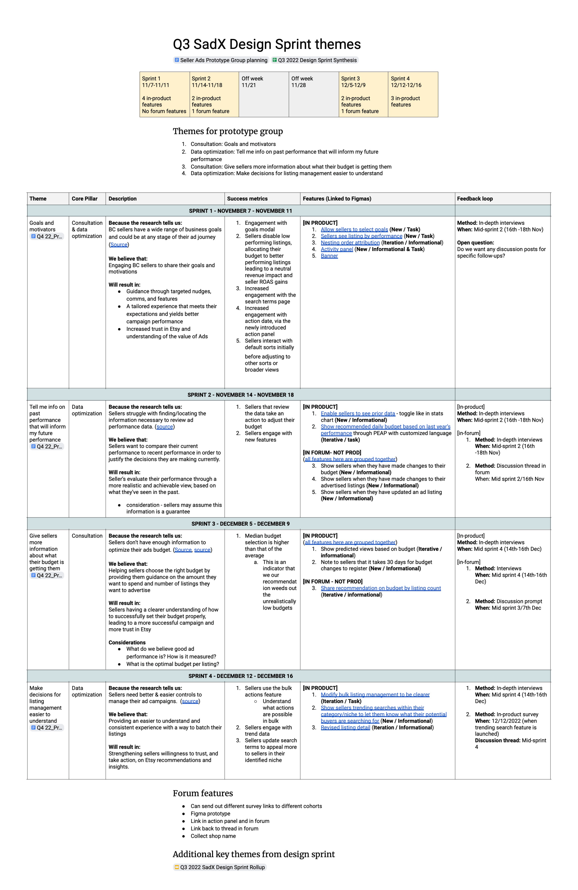
The four-week prototype group had lots of complexities with weekly themes, features, goals, metrics, and seller engagement channels
Feature 1: Performance and action
We knew that:
Sellers need a faster way to gut check their ads performance without parsing metrics
Sellers are looking for what actions they can take to optimize their ads
To help with quicker interpretation and offset data fatigue I wanted a way to visualize performance. I began exploring different layouts and mechanisms with my design partner.
Module sketches exploring different groupings and color as a tool, and data visualization inspiration
Design decisions:
I surfaced the three highest and lowest performing listings with data represented in a progress bar
I integrated a way for sellers to turn off advertising for their low performers in one click, making it easier for them to take action and use their budget more efficiently
This was a net new feature and stylistically like nothing we’d ever implemented. I met with the engineers early and often to align on feasibility as well as logic for all of the dynamic data involved.
Data reflected in a visual way on the ads dashboard
Sellers could filter by different metrics and turn off low performing listings in one click
Our goal was to reduce cognitive load for sellers and surface actions. A key metric was engagement with the button to turn off ads for low performing listings.
Results and next steps: The majority of sellers did turn off low performers while leaving ads on for high performers. 79% of sellers found this feature very helpful making it the top-ranked most helpful feature.
Before we could this roll out we needed to do more investigation on the potential impact that disabling listings could have on the overall ads ecosystem.
“It was nice for me to quickly see what was performing well and what wasn't, and it was easy to make some updates.”
– Power seller
Feature 2: Managing advertised listings
We knew that:
Some sellers were unaware that listing management, a core feature, was available through the ads dashboard
Sellers needed an easier way to manage listings in bulk
Listing management was one click in from the dashboard adding friction, and bulk editing existed but wasn’t easy to use with faulty checkbox logic and key actions buried in the footer.
Before: Sellers had to click into a dedicated page to manage their listings and bulk editing was faulty
Design decisions:
Listing management was moved to the ads dashboard for easier access, I changed the default filter to show only advertised listings, and added control over the number of listings in view to rein in page length
I moved primary bulk edit actions to the header, added a filter to choose a clear action, and revised the checkbox logic
I accounted for mobile, adjusting filters and actions to fit that device
After: Less friction to manage listings on the Ads dashboard
After: Revised hierarchy and logic for bulk editing
On mobile the data-heavy table was condensed and bulk edit features were hidden
Our goal was a single view that allowed sellers to easily take action on listings. A key metric was how much sellers took action on their listings, either individually or in bulk.
Results and next steps: Sellers engaged with bulk editing and found it intuitive, and valued seeing advertised listings as the default. We rolled this out to the full experience.
Feature 3: Granular data by listing
We knew that:
Sellers shuffle between multiple pages and even personal spreadsheets to make sense of their data at a listing level
5 out 6 sellers failed to find the ads search terms page in a usability study
Sellers had access to search terms and orders associated with a listing but on an outdated, piecemeal page that was buried two clicks in from the dashboard.
Before: Search terms and orders data for a listing was buried and on an outdated, unstructured page
Design decisions:
I modernized the page using current design system modules, and leaned into transparency surfacing many new data points in an intentional way
Access to this page also moved higher with moving listing management to the ads dashboard
After: Clearer hierarchy and modernized styling using latest design system with familiar patterns from the seller experience
After: Sellers could manage advertising for this listing and see a range of historical data
After: The updated designs moved data higher up the page and were optimized for mobile
Our goal was to make it easier for sellers to get detailed data about a listing. Key metrics were click-through to this page and engagement with search terms.
Results and next steps: 340 sellers clicked through and modified their search terms. This page was perceived as easy to understand and 77% of participants found it to be very helpful. We rolled this out and began exploring a more robust search terms feature.
Project details
Role: Designer
Core team: 2 designers, 1 researcher, 1 product manager, 1 engineering manager, 7 engineers, 1 analyst
Partners: 1 quant researcher, 1 product marketing manager, 1 member services rep
Timeframe: Q4 2022